Von Restorff Effect: What stands out is remembered
A red element among grey ones is seen instantly and remembered longer. How the Von Restorff Effect works and why it only works sparingly.

The problem: everything shouts, nothing stands out
The principle: isolation makes things visible
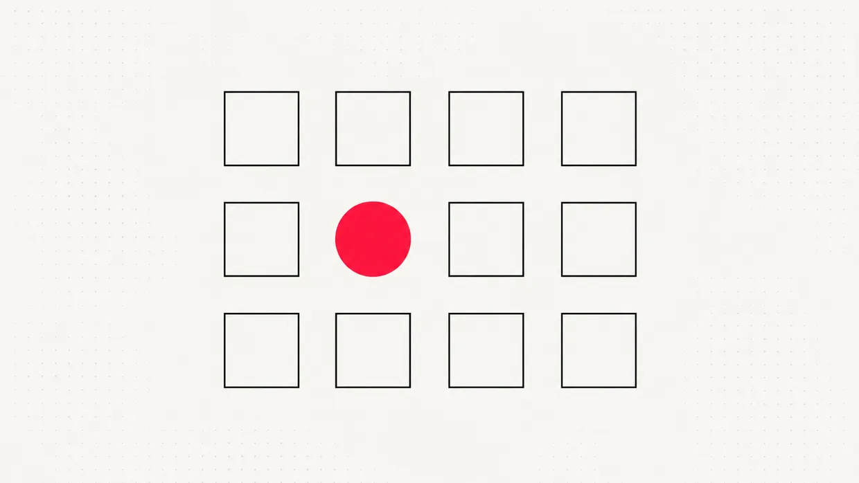
Means of emphasis
| Means | Example | Note |
|---|---|---|
| Colour | Primary button in brand colour | Never use as the only signal |
| Size | Larger area for the main action | Matches Fitts' Law |
| Shape | Filled button next to text links | Clear hierarchy |
| Spacing | Plenty of white space around a key message | Feels premium |
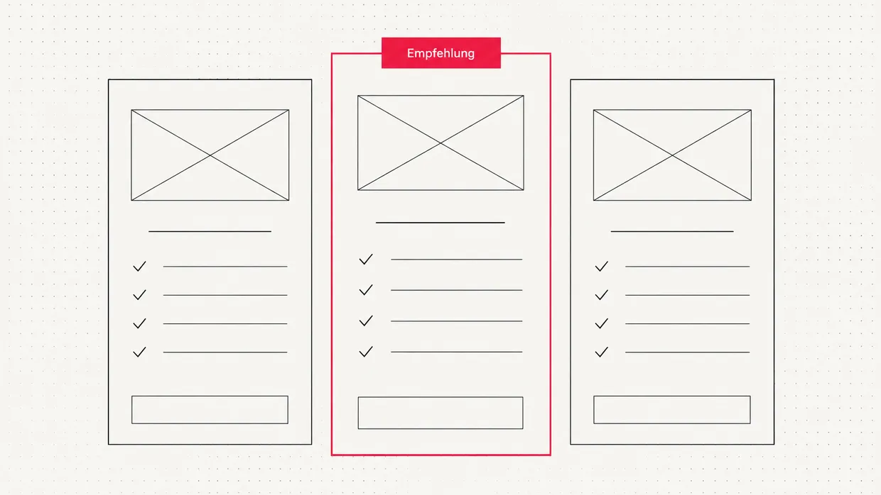
| Label | "Recommended" badge in a pricing table | Gives contrast a meaning |
| Motion | Subtle animation on first load | Sparingly, otherwise it feels like an ad |
Typical uses on websites
- The primary call to action. One clearly highlighted button per screen, everything else more restrained.
- The recommended package. In pricing tables a marked column guides the eye to the best option.
- The key message. A single large statement in a calm setting sticks.
- Important notices. Deadlines or error messages need their own instantly recognisable signal.
Limits and pitfalls
- Not just colour. About one in twelve men has a colour vision deficiency. WCAG requires that information is not conveyed by colour alone. [3]
- Not like advertising. Overly loud elements resemble banners and get ignored deliberately.
- Not inflationary. Three highlighted elements on one screen cancel each other out.
Related principles
We have a simple rule: red is a tool, not decoration. When we use it, it is for exactly one thing that really needs to be seen.
Quick check
- Is there exactly one element per screen that clearly stands out?
- Is the emphasis recognisable without colour?
- Does the highlighted element feel like part of the design rather than an ad?
- Is the recommended option marked in your pricing table?
Frequently asked questions
What is the Von Restorff Effect?+
Who was Hedwig von Restorff?+
How do I use the Von Restorff Effect on my website?+
Why does the effect stop working when everything is highlighted?+
Is colour alone enough for emphasis?+
Is the Von Restorff Effect the same as banner blindness?+
How is the effect used in pricing tables?+
Sources
- Über die Wirkung von Bereichsbildungen im Spurenfeld, Psychologische Forschung (1933)
- The Von Restorff Effect, Jon Yablonski, Laws of UX (2024)
- Use of Color, WCAG 2.2 Success Criterion 1.4.1, W3C (2023)

Josef leads the strategic and creative development of brands at Maluure. For over a decade, he has guided medium-sized businesses from brand positioning to digital delivery.
Managing Director of Maluure GmbH, Cologne. Specialising in corporate design, brand strategy and digital brand experiences.
Related articles

Fitts' Law: Why important buttons need to be big and close
The bigger and closer a target, the faster you hit it. Fitts' Law explains why small, distant buttons cost clicks.

Miller's Law: 7 ± 2, chunking and good menu structures
The famous 7 ± 2 is often misquoted. What Miller's Law really says and how to structure content so it sticks.

The Homepage That Wants to Say Everything at Once
Many company homepages don't fail because of design, they fail because of the message: they try to tell every visitor everything. Why that doesn't work, and how to arrive at a clear core message.