Marketing & Communication
    Practical article

    The Homepage That Wants to Say Everything at Once

    Many company homepages don't fail because of design, they fail because of the message: they try to tell every visitor everything. Why that doesn't work, and how to arrive at a clear core message.
    of Josef Kujawski5 min read
    The Homepage That Wants to Say Everything at Once
    Short answer
    A homepage that tries to say everything at once ends up saying nothing. First-time visitors decide within a few seconds whether to stay, and in that time they can absorb exactly one message. The solution: a clear core message for the most important visitor type, a single next step, and everything else moves to subpages. That turns the homepage from a company brochure into a signpost.

    The problem: the homepage as a company brochure

    In almost every website project we experience the same moment: the homepage is supposed to introduce the company, list all services, show the team, prove references, announce news and, ideally, also list open positions. The result is a page that contains something for every internal stakeholder and gives no visitor a clear direction.
    The observation behind this: homepages are rarely built for visitors, they're built as a compromise between departments. Everyone gets their section, and nobody gets attention.

    The principle: one page, one core message

    Attention is the scarcest resource on the web. A first-time visitor decides within a few seconds whether to stay. In those seconds, they can absorb exactly one message. Not three, not seven. One.
    This isn't a Maluure dogma, it's well documented: studies on dwell time show that most visitors leave a page again within the first ten to twenty seconds if they don't immediately understand what it's about and what they'll gain. [1]

    Context: why this is so hard

    Internally, every service feels important, because every service generates revenue. The flaw in that thinking: the homepage isn't a table of contents, it's an entrance gate. The table of contents can sit behind it. Anyone who tries to turn the gate into the catalog loses people before they're even inside.
    On top of that there's a psychological effect on the makers' side: the fear of leaving something out. Whatever isn't on the homepage feels like it's been given up. In reality, it's just been sorted.

    Application: the three questions for every homepage

    Before talking about layout or colors, we answer three questions:
    1. Who arrives here? Not "everyone," but the most important visitor type.
    2. What should this visitor understand in the first five seconds? One sentence, not a paragraph.
    3. What's the next sensible step? One action, not four.
    Everything on the homepage must serve one of these three answers. Whatever doesn't gets moved to subpages, where it's found by people specifically looking for it.
    Kernaussage
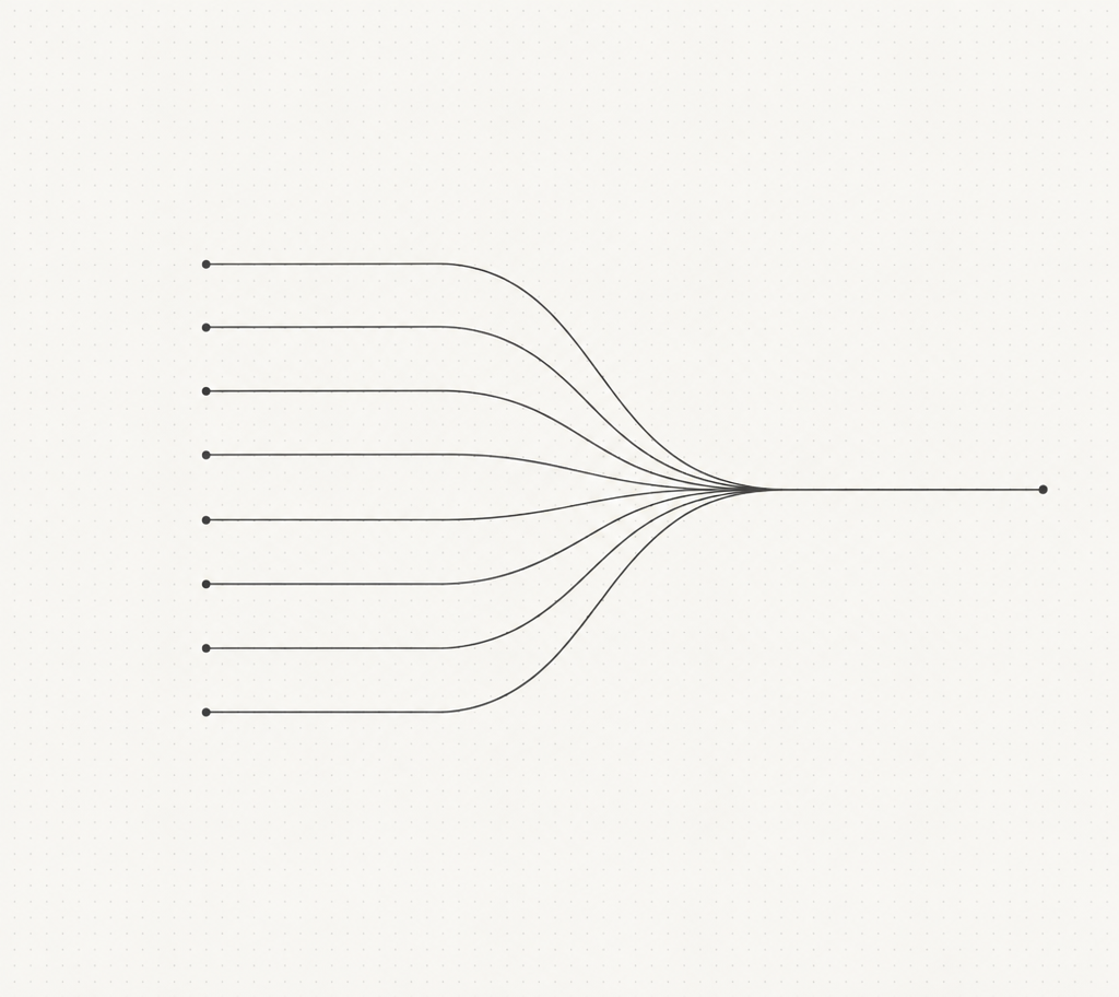
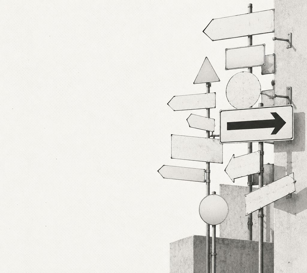
    A homepage isn't a brochure, it's a signpost. Its job isn't to say everything, it's to quickly guide the right visitor to the right place.

    The solution: a proven approach

    Here's how you get from the brochure homepage to a clear homepage:
    • Inventory: List everything currently on the homepage and mark which visitor question each section answers.
    • Prioritization: Choose the one message a first-time visitor must understand. Put it into a single sentence.
    • Move instead of delete: Everything else gets a good spot on subpages. Nothing gets lost, it just gets found instead of forced on people.
    • Test: Show the new homepage to five people who don't know your company, and after five seconds ask: what does this company do, and for whom?
    ElementBrochure thinkingSignpost thinking
    HeroCompany name plus taglineValue proposition for the most important visitor
    ServicesAll eight as tilesThree entry points, rest via navigation
    NewsLatest announcement at the topOnly if it concerns the first-time visitor
    TeamFaces on the homepageLinked when trust is needed

    The Maluure approach

    We treat the homepage like the entrance to a good building: you're greeted, you know immediately where you are, and you're quickly guided to where you want to go. Nobody hangs the entire company chronicle on the wall in the lobby.
    The best homepage isn't the one with the most content, it's the one where a stranger can say after five seconds what you offer and whether it's relevant to them.
    – Josef Kujawski, Geschäftsführer Maluure GmbH

    Frequently asked questions

    What's the most important message on a homepage?+
    The answer to the first-time visitor's question: what's being offered here, and is it relevant to me? That answer must be understandable within a few seconds, in a single sentence.
    How much content belongs on a homepage?+
    As much as needed to guide the most important visitor type to the next step, and as little as possible. Anything that only matters to internal stakeholders belongs on subpages.
    Why is it bad to show all services on the homepage?+
    Because visitors don't experience the selection as a service, they experience it as a decision burden. A curated selection of two to four entry points measurably leads to the goal more often than a complete list.
    Where should news, team and company history go?+
    On their own subpages, linked from the navigation and footer. Anyone looking for them will find them there specifically. On the homepage, this content only crowds out the core message.
    How do I test whether my homepage is clear?+
    With the five-second test: show the page to people who don't know your company, hide it after five seconds, and ask what the company offers and for whom. If the answers fail, the message isn't clear enough.
    Does this also apply to large companies with many target groups?+
    Yes, especially to them. Large companies solve this with clear entry points per target group instead of more content. Every target group gets its own path, not its own section on the same page.

    Sources

    1. Nielsen Norman Group: How Long Do Users Stay on Web Pages?, Nielsen Norman Group

    #Homepage#Communication#Positioning#Conversion#Web Design
    Josef Kujawski
    Author
    Josef Kujawski
    Managing Director & Creative Director at Maluure

    Josef leads the strategic and creative development of brands at Maluure. For over a decade, he has guided medium-sized businesses from brand positioning to digital delivery.

    Managing Director of Maluure GmbH, Cologne. Specialising in corporate design, brand strategy and digital brand experiences.

    Newsletter

    New articles straight to your inbox.

    A newsletter when we genuinely have something new to share. No noise.