Hick's Law: Why Every Extra Option Slows Down Your Website
The more options you give visitors, the longer they take to decide, and the more often they decide not to decide at all. Hick's Law explains the connection, and we show what to do about it.
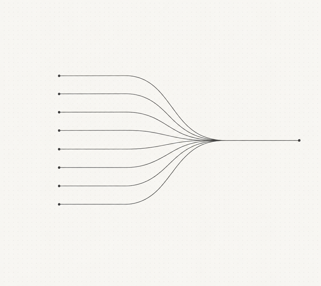
The problem: your website offers too many paths
The principle: Hick's Law
Origin and context
Application to digital products
- Navigation: Seven menu items aren't twice as bad as four, but they're noticeably more costly. Usability studies recommend limiting top-level navigation to the essentials. [3]
- Call-to-actions: Two equally weighted buttons next to each other ("Call us" and "Fill out the form") don't split clicks evenly, they dilute them.
- Forms: Every additional required field is a micro-decision. Every dropdown with thirty entries is a brake.
- Pricing pages: Three plans work better than seven, because comparability is preserved.
The solution: designing decisions on purpose
- One main action per section. Secondary actions can exist, but must be visually clearly subordinate.
- Group navigation instead of stretching it. Seven equal items become three groups with sub-items.
- Set defaults. If 80% of users make the same choice, make it the default.
- Progressive disclosure. Show options only once they become relevant, not all at once.
| Location | Typical mistake | Better solution |
|---|---|---|
| Main menu | 9 top-level items | 4–5 items, rest grouped |
| Hero section | 3 equally weighted buttons | 1 primary button, 1 text link |
| Contact form | 12 fields | 4 fields, rest optional in conversation |
| Pricing page | 6 plans | 3 plans plus "Custom" |
The Maluure approach
The most common cause of weak websites isn't bad design, it's too many equally weighted decisions. If you make everything important, you make nothing important.
Related articles
Frequently asked questions
What does Hick's Law state?+
What does Hick's Law have to do with web design?+
How many menu items are ideal?+
Does that mean I should offer as little as possible?+
How do I apply Hick's Law to forms?+
Does Hick's Law apply to online shops too?+
Sources
- Hick, W. E. (1952): On the rate of gain of information, Quarterly Journal of Experimental Psychology (1952)
- Hyman, R. (1953): Stimulus information as a determinant of reaction time, Journal of Experimental Psychology (1953)
- Nielsen Norman Group: Hick's Law, Making the choice easier for users, Nielsen Norman Group

Josef leads the strategic and creative development of brands at Maluure. For over a decade, he has guided medium-sized businesses from brand positioning to digital delivery.
Managing Director of Maluure GmbH, Cologne. Specialising in corporate design, brand strategy and digital brand experiences.
Related articles
The Paradox of Choice: Why More Options on Your Website Mean Less Revenue
The paradox of choice explains why visitors faced with too many options decide nothing at all. With the jam experiment, the limits of the effect, and concrete rules for navigation, pricing pages, and forms.
The Peak-End Rule: What Visitors Really Remember About Your Website
The peak-end rule explains why people judge experiences by their peak and their ending, not by the average. With Kahneman's experiments and concrete rules for checkout flows, contact forms, and farewell pages.
The Homepage That Wants to Say Everything at Once
Many company homepages don't fail because of design, they fail because of the message: they try to tell every visitor everything. Why that doesn't work, and how to arrive at a clear core message.