Aesthetic-Usability Effect: Why beautiful design seems easier to use
Beautiful interfaces seem simpler, even when they are not. What the Aesthetic-Usability Effect means for web design and where it misleads.
The problem: pretty does not automatically mean good
The principle: beauty rubs off
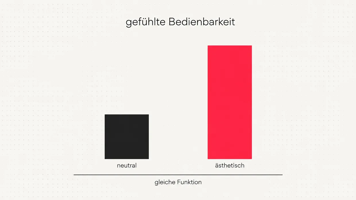
Two sides of the effect
| Opportunity | Risk |
|---|---|
| More trust at first impression | Real usability problems go unnoticed |
| Users forgive small hurdles | Positive ratings despite failed tasks |
| Professional appearance as competitive edge | Aesthetics becomes an excuse for skipping tests |
| Greater willingness to engage | Disappointment when function does not live up to design |
What this means for your website
- Design is not a luxury. Especially for services, the website is often the first proof of care.
- Consistency beats effects. A calm, unified look across colour, type and imagery feels more premium than isolated gimmicks.
- Test anyway. Let real people solve concrete tasks and watch where they get stuck.
- Keep the promise. Beautiful design raises expectations. Fast load times and clear flows have to deliver.
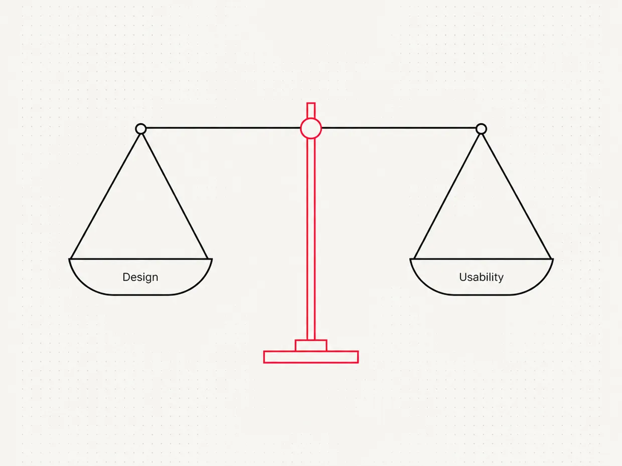
Related principles
For us good design is never an end in itself. It is the reason people give a website a chance in the first place. What happens after that is decided by usability.
Quick check
- Does your website look careful and consistent at first glance?
- Do colours, fonts and images follow a clear brand line?
- Have real users ever tested your most important flows?
- Does the site deliver what the design promises, for example in load time and forms?
Frequently asked questions
What is the Aesthetic-Usability Effect?+
Who discovered the Aesthetic-Usability Effect?+
Why does beautiful design seem more usable?+
Can the Aesthetic-Usability Effect be harmful?+
Is usability more important than design?+
What does the effect mean for small businesses?+
How do you measure whether a page is really easy to use?+
Sources
- Apparent usability vs. inherent usability: experimental analysis on the determinants of the apparent usability, CHI '95 Conference Companion, ACM (1995)
- What is beautiful is usable, Interacting with Computers (2000)
- The Aesthetic-Usability Effect, Nielsen Norman Group (2017)

Josef leads the strategic and creative development of brands at Maluure. For over a decade, he has guided medium-sized businesses from brand positioning to digital delivery.
Managing Director of Maluure GmbH, Cologne. Specialising in corporate design, brand strategy and digital brand experiences.
Related articles
Fitts' Law: Why important buttons need to be big and close
The bigger and closer a target, the faster you hit it. Fitts' Law explains why small, distant buttons cost clicks.

Jakob's Law: Why users expect familiar patterns
Your visitors know hundreds of other websites. Jakob's Law explains why familiar patterns are understood faster than original ones.
The Peak-End Rule: What Visitors Really Remember About Your Website
The peak-end rule explains why people judge experiences by their peak and their ending, not by the average. With Kahneman's experiments and concrete rules for checkout flows, contact forms, and farewell pages.