The Paradox of Choice: Why More Options on Your Website Mean Less Revenue
The paradox of choice explains why visitors faced with too many options decide nothing at all. With the jam experiment, the limits of the effect, and concrete rules for navigation, pricing pages, and forms.
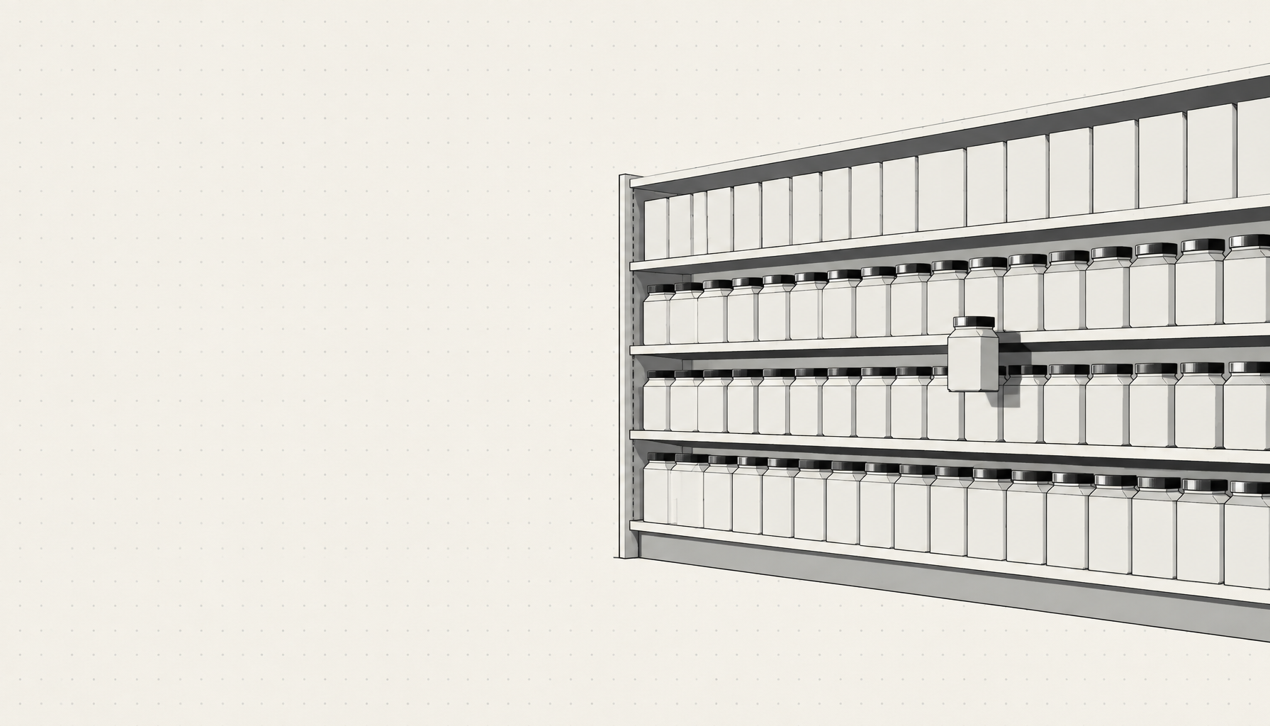
The Problem: You Offer Everything, and Nobody Chooses Anything
The Principle: More Options, Fewer Decisions
- Decision paralysis: every additional option must be checked and weighed against all the others. Beyond a certain number, the effort exceeds the expected benefit, and the easiest decision is no decision.
- Regret after choosing: anyone who picks one out of thirty options has rejected twenty-nine. The feeling of having chosen wrong lingers, even when the choice was good.
Origin and Context
Applying It to Digital Products
- Navigation: every menu item is an option that consumes attention. Five to seven main items are a proven upper limit; everything else belongs in submenus or subpages.
- Pricing pages: three packages work better than six because they remain comparable. One clearly marked middle package gives uncertain visitors a safe choice.
- Forms: every dropdown with twenty entries costs completions. A few clear options plus a free-text field for special cases work better.
- Homepages: showing all services with equal weight on the homepage forces a decision the visitor does not want to make. One primary path with clear side routes beats the full display.
The Solution: Break Decisions into Small Steps
- Count the decisions per page. Each page should demand one primary decision, not five at once.
- Build in a recommendation. A marked standard package or a "most customers start here" removes the fear of choosing wrong.
- Group instead of listing. Twelve services in three thematic groups are three decisions instead of twelve.
- Use filters and guidance. A short configurator or three entry questions replace an endless list and lead to the right offer.
| Situation | Too much choice | Better |
|---|---|---|
| Navigation | 9 menu items | 5 main items, the rest in submenus |
| Pricing page | 6 packages side by side | 3 packages, one marked as recommended |
| Contact form | 25 topics in a dropdown | 5 topics plus free text |
| Homepage | All services equally large | One primary route, clear side paths |
The Maluure Approach
Most websites do not lose customers because the offer is missing, but because visitors cannot find it in the flood of options. Our job is to make the first decision so small that nobody is afraid of it.
Related Articles
- Hick's Law: Why Every Additional Option Slows Your Website Down
- The Homepage That Wants to Say Everything at Once
- Eugene Schwartz' 5 Levels of Awareness
Frequently asked questions
What is the paradox of choice?+
What was the jam experiment?+
Does the paradox of choice always apply?+
How many menu items should a website have?+
How many pricing packages are ideal?+
What is the difference from Hick's Law?+
How do I apply the principle to my website?+
Sources
- Barry Schwartz: The Paradox of Choice. Why More Is Less, Harper Perennial (2004)
- Iyengar, S. S. & Lepper, M. R.: When Choice is Demotivating. Journal of Personality and Social Psychology, 79(6), American Psychological Association (2000)

Josef leads the strategic and creative development of brands at Maluure. For over a decade, he has guided medium-sized businesses from brand positioning to digital delivery.
Managing Director of Maluure GmbH, Cologne. Specialising in corporate design, brand strategy and digital brand experiences.
Related articles
The Homepage That Wants to Say Everything at Once
Many company homepages don't fail because of design, they fail because of the message: they try to tell every visitor everything. Why that doesn't work, and how to arrive at a clear core message.
Hick's Law: Why Every Extra Option Slows Down Your Website
The more options you give visitors, the longer they take to decide, and the more often they decide not to decide at all. Hick's Law explains the connection, and we show what to do about it.

Eugene Schwartz's 5 Levels of Awareness: Why Nobody Buys Before They're Ready
Eugene Schwartz's five levels of awareness explain why the same copy works on one visitor and fails on the next. Includes a mapping table and practical steps for websites.